In Search of the Perfect Calculator
As an engineer, I find the often underrated calculator application to be
an invaluable tool. From double-checking simple calculations, to working
with large numbers in different bases, it tends to be the constant
companion of my pen and paper. Years ago, xcalc was my goto calculator
program. Released in 1987 and meant to emulate the TI-30, it was a great
scientific calculator for the time.
At some point, I began using gcalc, a GTK+ clone of xcalc. Then, I
moved up to
galculator. And,
from there, on to
gcalctool.
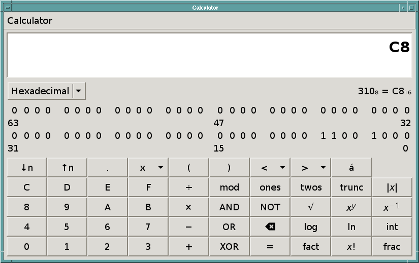
Recently, I began to notice that the gcalctool window takes up nearly
1/3 of my display (width-wise) in Programming mode (825x519), and that
the layout of the digits is a bit bothersome. I suppose I had become too
used to the typical 3x3+1 telephone keypad-style layout of most
calculators/numpads.

Why the hell does a calculator need to occupy that much space on my
screen? Even if I decrease the font size, I'm fairly certain that the
window would still be insanely large. I've always believed that
productivity tools should be helpful and stay out of the way.
Thus, I decided the time has come for xcalc to get some new
features, such as:
- Bitwise ops (e.g. and, xor, shl, shr)
- Modulus
- Base conversion (Decimal, Hexadecimal, Octal)
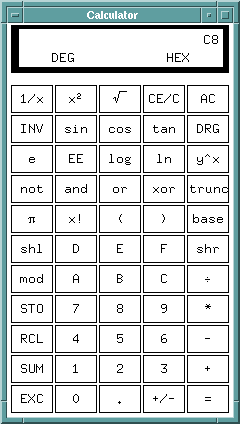
It only took a couple of hours to add these features in, and in doing so made xcalc more useful for me than either galculator or gcalctool. After adding three rows of buttons to the UI, xcalc takes up a whopping 240x424 pixels. This means I can easily fit three xcalc windows side-by-side in the same space required for one gcalctool window. I also added shortcut keys for the new operators. Now I'm free to use more of my screen real estate for more important things, and you have to admit that even after nearly 27 years, xcalc still looks pretty bad-ass.

I've sent a little patch upstream (currently pending acceptance), and as always the source code for my modifications can be found on Github.